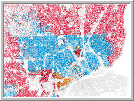
These images have been generating a lot of comments lately, but if you haven’t seen them yet, you really should. Shown below is a picture of Detroit, color-coded (ahem) by the ethnicity of the residents. If you had to guess, where would you say the border was between the city of Detroit and its surrounding suburbs?

Eric Fischer created this image (and many others like it) using census data. He, in turn, was inspired by Bill Rankin, who runs a site called from a site called Radical Cartography where he created a similar sort of plot for Chicago.
There’s lots of other great stuff on Radical Cartography, including this chart on ethnicity and population density. It tells you something that you already know, but it’s interesting to see: where the population is sparse, it’s overwhelmingly white. I’m going to spend a while crawling through all these maps…
Look at Fischer’s various city maps, and see if you don’t agree with me that the level of segregation in America is disappointingly obvious. By the way, of the various blogs I came across talking about Fischer’s plots, I particularly enjoyed reading Brian Hayes’ discussion on bit-player. He includes a discussion about how one can demonstrate mathematically that sharp segregation gradients can come about through surprisingly mild preferences.